
Gradients have been at the helm of email developers’ attention since the very inception of HTML email templates. This design trend dates back to 1995, and it came back into fashion after Apple started using blurred overlay effects as a major part of its UI design. However, Instagram’s 2016 logo makeover and UI can be considered as the trendsetter that reintroduced gradients back 1n the design world. Gradients help add depth to your email design and grab reader attention. Today, I will share a couple of tips on using gradients in email design, along with a few examples. Get ready for the perfect guide for using gradients for your next email.
Why Almost Everyone Loves Gradients
A gradient is a nature-inspired design. Evenings and sunrise are the two best examples of natural gradients. They are eye-soothing, and they work as excellent backgrounds since anything put in vision automatically captures our focus. Thus, gradients improve the visual appeal, grab attention, and deliver a refreshing user experience. Have a look at the below image to better understand why designers find gradients useful for aesthetics and readability:

You have almost 0.05 seconds to make a good first impression, and thus, it makes sense to use time-tested design elements like gradients.
How to Insert Gradients In Your Email Template Design
You can insert gradients in your HTML email templates using CSS. It may be either linear or radial, and you can go for a single color (monochrome) or multiple colors based on your design needs. I would bring to your notice that, like all other aspects of email design, there is no universal support for gradients as well. However, we can always use a fallback measure like replacing it with solid colors in case anything goes wrong. In most cases, CSS3 gradients are used as an inline style. An example of writing the code for a linear gradient inclined at 60 degrees is as follows:
background:linear-gradient(60deg, #252a45 0%, #921667 100%)
Also, you may need to add “mso-width-percent:1000” to ensure proper renderability on Microsoft Outlook. Make sure to add the primary background color before the inline style, as the email clients who don’t support CSS3 will display it as the background color, thus creating your fallback. There are a few other technicalities that vary from case to case, so it would be better to handover the task to seasoned email developers for the best results.
Examples Of Using Gradients In Emails
In this section, I will share some examples of using gradients in emails. Check them out to see if they inspire your next design:
1. 1973 Ltd
This is a great dual-tone gradient email coming from 1973 Ltd, a brand that often treats its subscribers with similar-looking messages. It looks very organized, and they have also used the same contrasting color scheme in the first image below the hero area. This gives the email a good amount of consistency and makes the newsletter look quite intense:

2. Allset
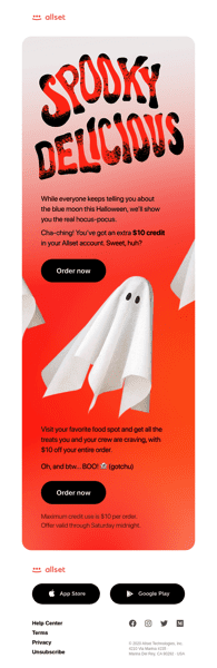
Allset has given a nice retro look to their message, and the typography in the hero image complements the gradient exceptionally well. Also, they have chosen black color for the CTA that looks extremely impactful. You can use a similar concept if you are looking forward to harnessing color psychology and blending it with your email copy. Bold background colors also make it easier for the user to find and click CTA buttons, as seen in the below example:
3. PicMonkey
PicMonkey sent this visual feast, and I am pretty sure that most of the readers would have loved it. The design looks vibrant, and it helps the image stand out. Also, the use of bold colors in the CTA helps to separate it from the rest of the elements. Such formats are suitable when you want to focus on one particular topic. Have a closer look:

4. Filmsupply
Now comes one of the most innovative examples of using gradients. Filmsupply has smartly used the images to give a gradient-like visual impact. The use of the background, ambiance, and shadows in each of these images makes the user feel that there’s a gradient, but in reality, it’s just smart composition. You can try this tactic in case you are looking for a 100% risk-free way of using this email design trend:

Summing Up
Toward the end, I would suggest you use base colors that contrast with your brand color palette. This ensures that your final design doesn’t look weird, as there isn’t much room to make changes in your brand elements. Also, make sure to use the tints and shades to your advantage. Gradients will help you give a sophisticated look and complement the visual hierarchy. I hope you find this guide on using gradients in emails helpful for your business.