No matter how solid a logo is, at some point it will inevitably become dated and be in need of a little rebranding. As a graphic designer, I know that rebranding can be a tricky business. You want to refresh the look of your logo without losing the integrity and intention behind that logo. What are some things that can be done to freshen up a logo? Let’s a look at some big branding overhauls to see what went right (or wrong)!
Olive Garden
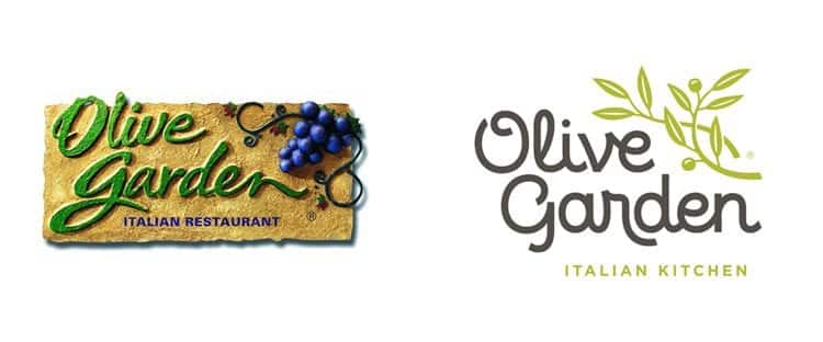
I don’t care who you are, everyone loves Olive Garden. With unlimited breadsticks and salad, what’s not to love? However, that old logo. To be honest, I’m kind of surprised that they waited so long to rebrand, it was long overdue. When the rebrand was released the design world was not overly impressed. Is it the most creative logo I’ve ever seen? No. Is it a giant improvement from the last one? Definitely. Whether or not you like the colors or the font, the biggest takeaway is this: To update an overdone, dated logo you need to simplify. They got rid of the background, the bad textures and the distracting color scheme. The result is a clean, modern logo that appeals to a much broader audience than the last one.
Reebok
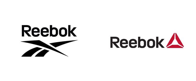
Have you seen the new Reebok logo? I have to say, I’m a fan. They kept the typography portion the same, but got rid of their old icon and replaced it with something completely new. I still like the old logo, but this new one has a much better format. The pop of color is nice too. Simple, clean and modern, this new logo is sure to stand the test of time.
Black and Decker
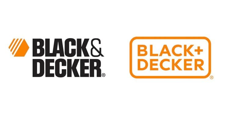
When Black and Decker rebranded I was seriously impressed. They did away with the icon that was previously next to the text, added a border and updated the text. It’s amazing how a few simple changes can make such a big visual impact. The great thing about this rebrand is that while the new design is sleeker and more up to date, it still conveys the same sense of toughness that is essential to their brand. Rebranding is most effective when you can maintain the authenticity of a brand while still giving the logo a fresh look. Switching out the ampersand for the plus sign was a brilliant move that not only simplifies but also updates their new logo.
Wendy’s
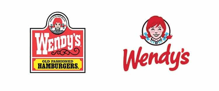
Over the past few years it really seems as though Wendy’s has really stepped up their game. The commercials, new logo and restaurant redesigns have really updated their brand. While I’m thoroughly tired of their commercials, I’m definitely loving the new logo. This logo is a prime example of why simplifying your brand actually allows your logo to have a much bigger impact. Look at the old logo, there’s a lot going on. A slogan, lots of dated design choices, and at the bottom it says “old fashioned hamburgers.” First of all, we all know that Wendy’s sells hamburgers, so getting rid of that extra information is a no-brainer. Slogans can work, but sometimes they just end up weighing a logo down. If it’s not absolutely essential for your logo to have a slogan or phrase, nix it. Let the rest of the logo speak for itself. They got rid of the odd shaped box and updated the text. Wendy got a little makeover, but still is recognizable. The end result is a much cleaner logo with a much bigger impact. Not to mention, the new logo is much more versatile for marketing.
What are some recent brand redesigns that you like or dislike?